Figure 1 Ungated Experience
Redesigned the Ungated experience for Figure 1 cases which helped double our sign up conversion rates.

Figure 1 is the largest global community of healthcare professionals.
However we were far from our goal of having at least 20% of US doctors as registered active users in our platform.
My role and responsibilities
I was the sole product designer in a team of 1 PM and 5 engineers (2 back end and 3 front end). I was responsible for research and design for the full end to end product development cycle.
Ungated cases was our best tool to convert users with the worst conversion rates
When I say ‘best way’, I am focusing on the massive potential Ungated cases have in acquiring new registrants. It allowed prospective registrants to see the value of Figure 1 without requiring them to sign up. But in reality, a less than 2% conversion rate left the Marketing team rather frustrated as they felt all their efforts of content promotion were wasted.
So I partnered with the Marketing team to lead a redesign of the Ungated experience.
Some additional context
Figure 1 had a good retention rate, great NPS score and a very loyal user community so we were fairly confident that the issues were that prospective users were not seeing enough to understand the benefits of signing up.
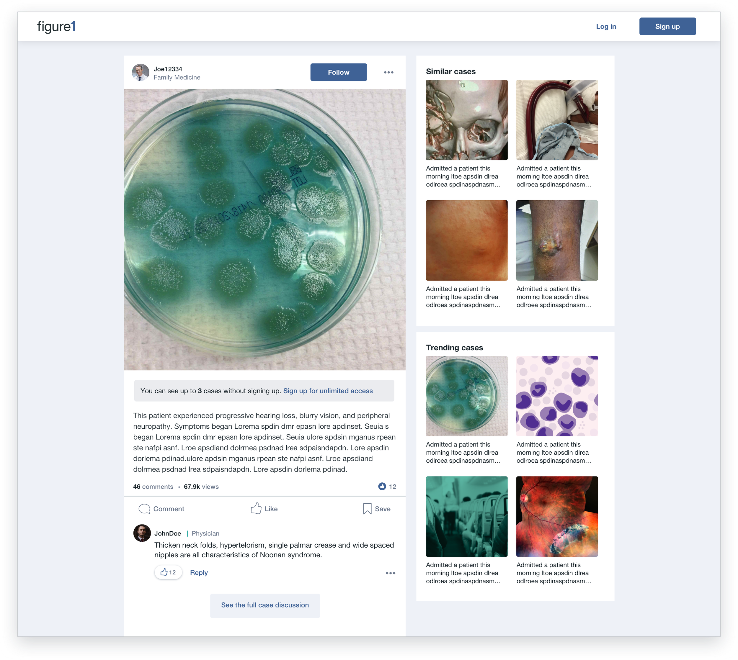
Above you can see the existing Ungated case screen which showed the full case and a banner with a couple lines of text describing vaguely why users should sign up.
Problems uncovered through research
We split our research plan in two to get insights and feedback from current users and prospective users who have never used Figure 1.
User testing with prospective users
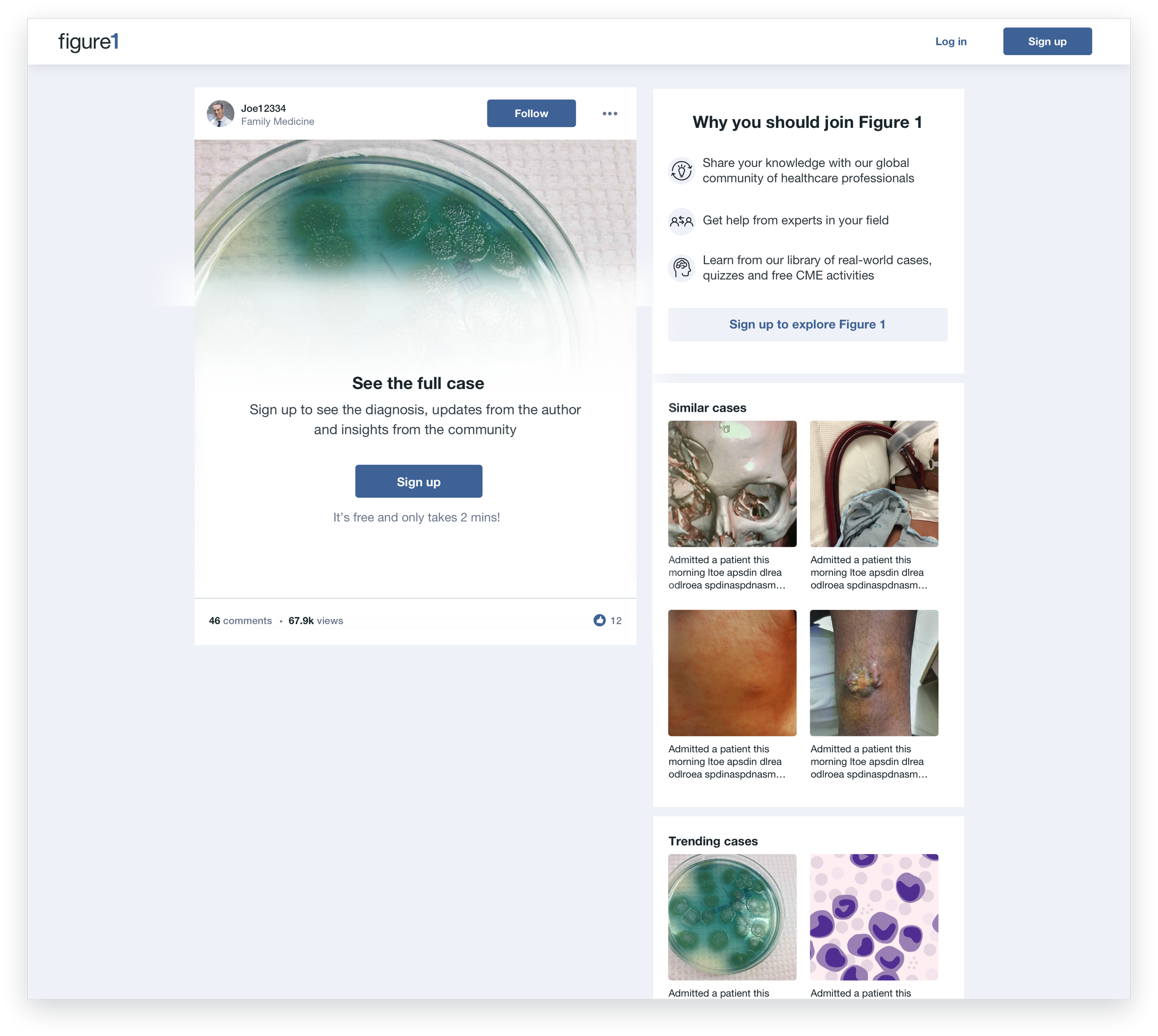
Prospective users assumed they would have to pay to get in the app due to our choice of words such as ‘Become a member’ and ‘Members-only community’ in the CTA banner.
They saw the case they clicked on and had no reason to sign up.
Interviewing existing users
Existing users felt the two most useful aspects of Figure 1 were:
Personalized cases with rare case images
Insightful discussions in comments section
Outcomes
A/B testing was crucial for this feature as we needed to optimize the copy and amount of content exposed to users in order to maximize conversion.

Version 1- Allowing prospective users to see up to 3 cases without having to sign up. This came from the Marketing team’s hypothesis that in order for people to want to sign up, they need to see more full cases to see the value of Figure 1.

Version 2- Prospective users would see a blocked case screen on their first visit. This strategy came from an email campaign A/B test we ran before where partially blocked images had the highest click through rates. Showing users more cases took away the sense of urgency to sign up.
Impact on sign up conversion
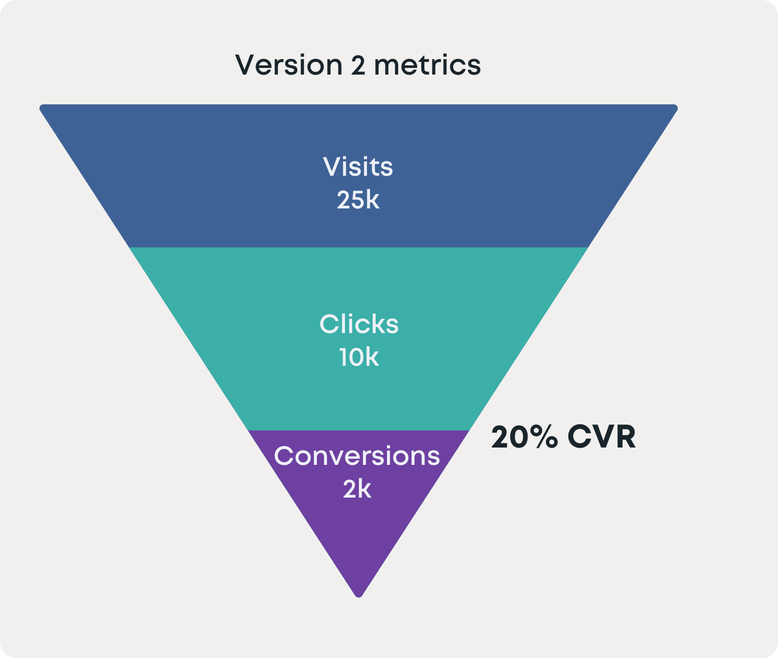
Version 2 (the blocked case experience) was significantly more effective in increasing sign up conversion. These metrics prompted leadership to invest in a cohesive Ungated experience for all Figure 1 content.


